Commercial painting is one of those projects you know you need, but you don’t want it to derail your business. You want the space to look clean and updated, but you also need employees, customers, and daily operations to keep moving. The best results come from a clear plan, real prep, and a schedule that respects how your building is used.
This guide walks you through what to expect from commercial painting services, how to plan the job around your busiest times, and what makes the finish hold up in real-world conditions. If you’re weighing timing, durability, and how much disruption is realistic, you’ll know what to ask for before work starts.
When commercial painting is worth it
Most commercial painting projects start with a moment you can’t ignore. Your lobby looks tired under bright lights. Your walls show scuffs that never fully clean up. Your exterior trim has faded enough that the building looks older than it is. Or your space changed and the paint no longer fits the way you want the business to feel.
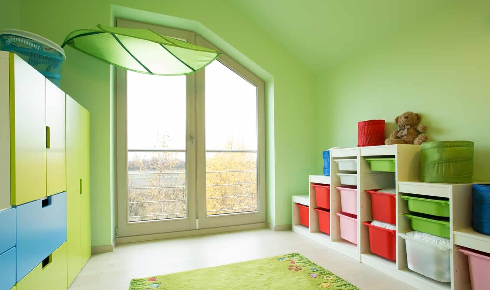
Painting is also worth it when you’re trying to create consistency. Maybe you have multiple rooms that don’t match, a patchwork of touch-ups, or older colors that make the space feel dim. A clean, consistent repaint can make the building feel more intentional without changing your layout or your fixtures.
If the goal is to refresh the space without starting a full remodel, painting is often the most straightforward move. It’s visible, it’s practical, and with the right schedule it can be completed in phases so you don’t have to shut everything down.
Commercial painting services vs renovation
A renovation changes the bones of a space. Commercial painting services change how the space reads the second someone walks in. That difference matters if you want a noticeable update without the extra trades, extra coordination, and extra downtime that bigger projects often bring.
Painting also gives you control. You can choose a full update or a targeted one. You can focus on customer-facing areas first, then move to offices, hallways, or back-of-house spaces when it makes sense. You can also plan the work around seasons, events, or staffing schedules so the project fits your reality.
If your space functions well and you’re mostly battling wear, dated color, or a finish that doesn’t hold up anymore, painting is often the cleaner path.
Common can’t-wait moments
Some businesses plan painting months in advance. Others realize it’s time when something changes fast. You bring in a new tenant. You expand into a new suite. You’re preparing for inspections, photos, or an event. You hire new staff and want the space to feel ready. Or you simply want the building to look like you care.
There’s also the “slow fade” moment where the space is technically fine, but it doesn’t feel sharp. When customers are in the space daily, even small issues stand out. Smudged doors, dingy trim, or a scuffed hallway can make the whole building feel neglected, even if the business is thriving.
A painting project works best when you treat it like operations planning, not a surprise. The earlier you map the job, the easier it is to protect your schedule.
Real prep in commercial painting
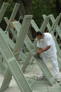
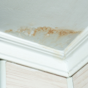
If you want commercial painting to last, prep is the foundation. Prep is where the paint job becomes professional instead of temporary. It’s also where a project stays clean and controlled, because good prep includes protection and organization, not just sanding or patching.
A practical prep plan starts with surface condition. High-traffic walls may need more repair. Doors and trim often need extra attention because people touch them constantly. Areas near break rooms or restrooms may require different care than a quiet conference room wall.
Prep also includes protecting floors, fixtures, furniture, and equipment. In commercial spaces, that protection is part of the workflow. The goal is a job that looks good and keeps your space functional while work happens.
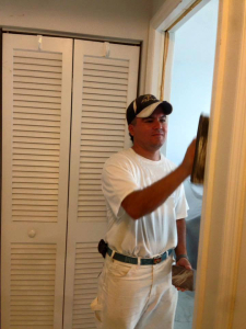
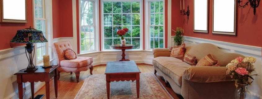
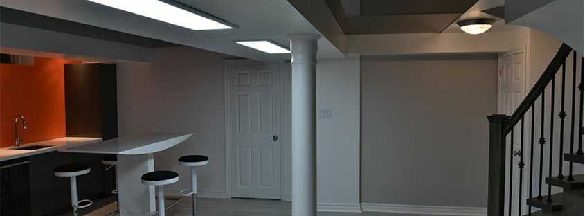
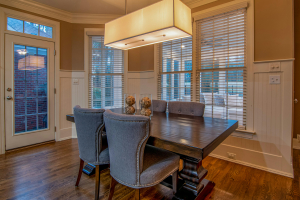
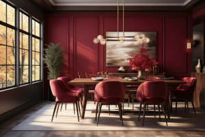
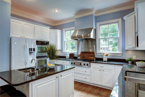
Interior painting services for busy spaces
Interior painting services in commercial buildings are often less about one perfect room and more about keeping a whole environment consistent. Offices, lobbies, hallways, stairwells, and shared spaces all read differently under commercial lighting. What looks fine at home can look harsh or uneven in a business setting if the work isn’t clean.
Interior work also needs better planning around people. You may need to keep certain routes open, avoid loud work during key hours, or schedule specific rooms for evenings or weekends. If your staff uses certain spaces all day, a phased approach keeps the building usable.
It helps to decide what “done” means before the first coat goes on. Is the goal to refresh walls only, or are you updating trim and doors too. Those details change the final look, and they also affect timeline.
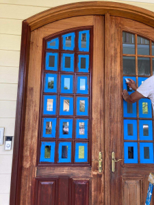
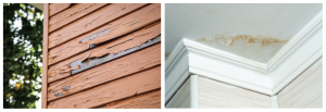
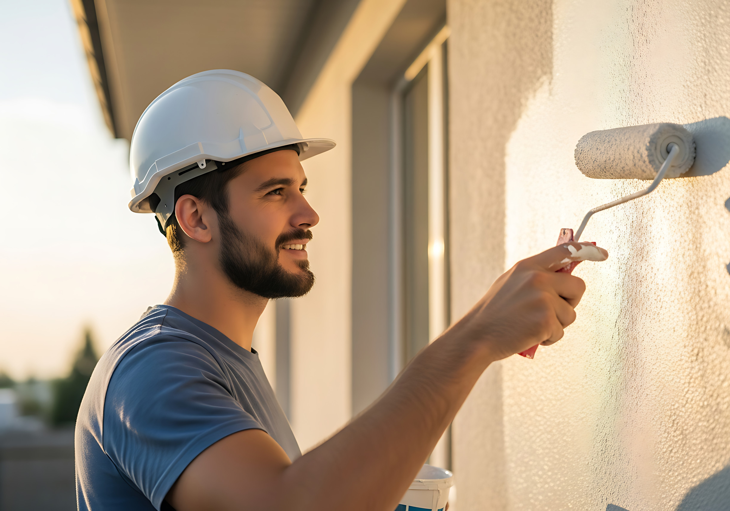
Exterior painting services and curb appeal
Exterior painting services are about first impressions, but they also set the tone for the business. Customers notice the entry, the trim, the doors, and the condition of visible surfaces. Even if the interior is excellent, a worn exterior can send the wrong signal.
Exterior projects also require more coordination because of access and exposure. You’ll want a plan that keeps entrances usable and keeps signage, doors, and walkways clear. If your building has multiple sides or multiple entry points, the schedule matters as much as the paint.
A good exterior plan focuses on what people see first and what gets the most wear. Entry doors, trim, railings, and high-touch areas are often where the payoff is fastest.
How commercial painters build durability
Durability comes from matching the paint system to the space and its use. A back hallway that sees carts and deliveries needs a different plan than an executive office. A public-facing lobby needs a finish that stays clean and consistent under frequent traffic and cleaning.
Clean lines and smooth coverage are part of it, but durability is also about the process. Proper surface preparation, the right primer approach where needed, and consistent application all affect how the finish holds up. If the job is rushed, it often shows later as scuffs, visible repairs, or uneven wear.
The best approach is to treat durability like a goal from day one. That means being honest about what needs repair, what needs extra protection, and what areas should be scheduled at times that allow the finish to set up properly.
Timeline and how long it takes
How long does it take is a fair question because businesses can’t pause life for a paint job. The timeline depends on scope, surface condition, how many areas are included, and whether the work is being phased around occupancy.
A smaller space with minimal repairs moves faster than a multi-room office with heavy wear and detailed trim. Hallways and stairwells can take longer because they require careful routing and protection. Exterior work can also add time depending on access and how many surfaces are involved.
The most useful timeline is one that’s broken into phases. Instead of one vague “start to finish” window, you want to know what areas will be worked on when, what areas need limited access, and what spaces will stay open.
Planning for low disruption
A commercial painting project is easiest when you plan it like a schedule puzzle. Identify peak hours, quiet hours, and spaces that must stay operational. Then build the work around those constraints.
If you have conference rooms that can be taken offline briefly, those can be good early targets. If your lobby must stay open, you may phase it into sections or schedule it for evenings. If you have sensitive equipment, you may want that area planned for a time when it can be protected and monitored closely.
It also helps to set expectations inside your team. Let staff know what spaces will be affected and when. When people aren’t surprised, they’re more patient, and the job moves smoother.
Cost factors that shape commercial painting
Painting costs are driven by scope and complexity, not just square footage. The number of rooms, the amount of repair work, the condition of trim and doors, ceiling height, and access all influence the amount of labor required.
Detail work also matters. Doors, frames, trim, and high-wear zones take more time than open walls. If the project involves careful cut-ins, multiple colors, or working around ongoing operations, that can also affect the plan.
The safest way to think about cost is to focus on what you want included and what you can phase. Some businesses choose to start with the most visible areas, then expand the scope later. That kind of phased approach can keep the project manageable while still delivering an immediate improvement.
Mistakes that make projects drag
The most common mistake is trying to treat commercial painting like a quick touch-up when the space needs real prep. If walls are worn and repairs are skipped, the final result can look uneven in bright commercial lighting.
Another mistake is not planning the flow of the building. If you don’t map traffic patterns and access needs, you can end up blocking the wrong hallway or painting a critical room at the worst time. That creates frustration and delays.
Choosing a plan that’s too broad can also backfire. If you try to do everything at once without phasing, the project can feel disruptive even if the work quality is strong. A better approach is to prioritize the areas with the biggest payoff and build outward.
Finally, don’t ignore the finish needs of the space. A high-traffic area should be treated like a high-traffic area, not like a spare room. The finish has to match reality.

FAQ: commercial painting
How do you decide the best time for commercial painting?
The best time for commercial painting depends on how your space is used, not just what month it is. Start by listing your busiest days, your busiest hours, and the rooms that can’t be taken offline. From there, you can plan a phased schedule that protects your operations. If evenings or weekends are easier, that can be built into the plan. If you need the lobby open every day, you can schedule the most disruptive steps around quieter windows and keep routes clear.
What should you expect from commercial painting services?
Commercial painting services should include more than paint on walls. You should expect a plan for surface preparation, repair work where needed, protection for floors and equipment, and a schedule that considers how people move through the space. You should also expect clear communication about what areas will be worked on and when. A well-managed job doesn’t rely on you guessing what’s happening. It keeps the workflow organized so you can continue operating while the project moves forward.
How long does commercial painting take for an occupied building?
How long does it take depends on the size of the space, how many rooms are included, the condition of the surfaces, and how much the work needs to be phased around occupancy. In an occupied building, the schedule often becomes a series of smaller phases rather than one uninterrupted block of time. That approach keeps your team working and your customers comfortable. A good timeline should tell you what’s happening in each phase, what areas need limited access, and what parts of the building stay open.
Can you combine interior painting services and exterior painting services?
Yes, and combining interior painting services and exterior painting services can be a smart way to refresh the full experience of your business. The key is scheduling them so they don’t collide with your busiest periods. Some businesses do exterior work first to improve curb appeal, then schedule interior updates in phases so employees can keep using the space. Others do the reverse. The right plan depends on visibility, wear, and which areas matter most to your customers and staff.
What should you ask commercial painters before booking?
Before booking commercial painters, ask how the project will be phased, what prep steps are included, and how the team will protect floors, furniture, and equipment. Ask how traffic flow will be maintained during the work and what areas may need limited access. If durability is a concern, ask how high-traffic zones will be handled differently from low-use rooms. Finally, ask how communication will work during the project so you know who to talk to if anything changes.
Commercial painting: plan your next step
Commercial painting can refresh your space without turning your week into a mess, as long as the project is planned around real operations and executed with solid prep. When the schedule is clear, the workflow stays organized, and the finish is built for how your building is used, the update feels straightforward instead of disruptive.
If you’re ready to start a commercial painting project, focus on defining your priority areas, the times your space must stay open, and the level of durability you need in high-traffic zones. Then you can request a quote for commercial painting and map out a schedule that keeps your business moving while the work gets done.

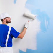
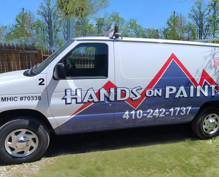
 When it comes to painting a home or commercial property, the final coat of paint often gets all the attention. But the real secret to a beautiful, durable finish happens long before the first brushstroke. At Hands On Painters, LLC in Baltimore, we know that exceptional prep work is what separates an average paint job from one that truly lasts.