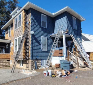
Cedar Shake House Painting – Our Specialty 1!
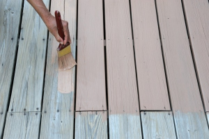
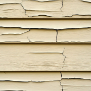
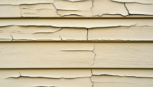
Painting cedar shake houses requires thorough surface preparation, including cleaning, scraping, and sanding, followed by a high-quality stain-blocking primer and a durable topcoat.The lifespan of the paint job depends on factors like climate and the prep work, but expect to repaint every 5–7 years for optimal protection and appearance.
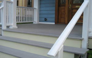
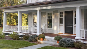
Since 1997, we’ve been renewing, refreshing, updating and beautifying homes in the Central Maryland areas with a new coat of paint. Our residential painting starts with quality surface preparation techniques that insure a clean-professional result that will last for years. We use only quality, low-VOC (volatile organic compounds) paint products that will provide the interior, or exterior, of your home with a premium finish.
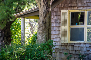
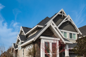
SUMMER & CEDAR – Heat and humidity can harm cedar shingles, causing them to dry out, crack, warp, and age prematurely. Excessive moisture, particularly in extremely hot weather, can also lead to decay and insect issues. Staining and painting can help prevent & protect.
Fall is the perfect time to restore and protect your home so that when next summer rolls around you can be the envy of the neighborhood.
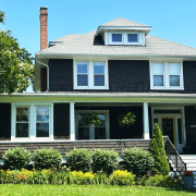
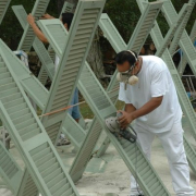
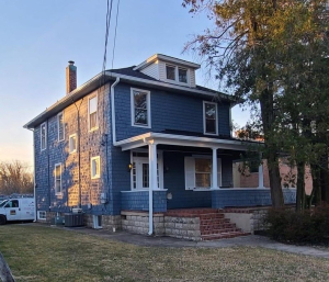
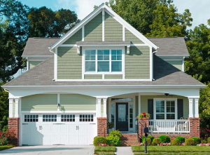
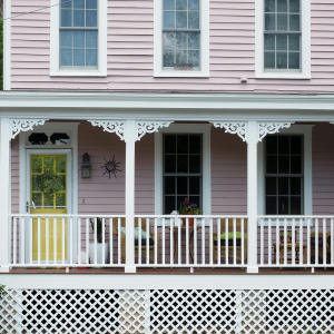
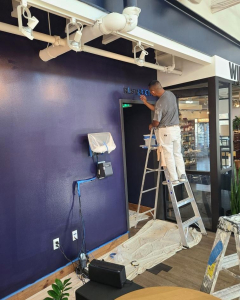
We do a lot of house painting in the Catonsville area and one of our specialties is restoring and painting cedar shake homes. Here is an example of an amazing transformation after extensive cedar repair and painting!

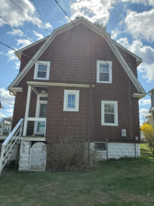
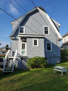
BEFORE & AFTER! “The time has come to show the before and after pictures of our house. Thank you to, Jonathan Zawacki, Hands on Painters…our house is beautiful. So exciting…to (see) this big cedar shake and it not the ugliest on the street.” ~ Erica G.
If cedar shake siding is installed and maintained properly, it will last for 30 years or more! 𝘖𝘷𝘦𝘳 𝘵𝘩𝘦 𝘺𝘦𝘢𝘳𝘴, 𝘸𝘦 𝘩𝘢𝘷𝘦 𝘸𝘰𝘳𝘬𝘦𝘥 𝘰𝘯 𝘮𝘢𝘯𝘺 𝘤𝘦𝘥𝘢𝘳 𝘩𝘰𝘮𝘦𝘴 𝘪𝘯 𝘵𝘩𝘦 𝘊𝘢𝘵𝘰𝘯𝘴𝘷𝘪𝘭𝘭𝘦 𝘢𝘳𝘦𝘢. On this one, we needed to blend the old shingles with new ones. We used WoodScapes® Exterior House Stain, which offers rich, beautiful coverage. It has a self-priming formula that enhances appearance and provides exceptional protection and resistance to peeling.

The lifespan of the paint job depends on factors like climate and the prep work, but expect to repaint every 5–7 years for optimal protection and appearance.
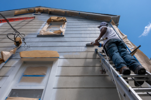
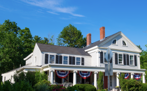 As many homes in our area still have trees on some sides, uneven color fading can occur. This is our forte to pay attention to correct preparation and application of our products. Having been in the Catonsville area for so many years. We know how important independence day celebrations are. Sometimes power washing can extend the life of your


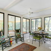
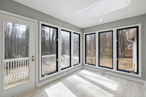
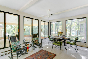 The sunroom is often the favorite room in the house. A fresh coat of paint will brighten it up and enhance your enjoyment.