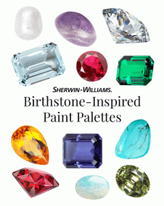
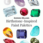
Most of us know our birthstone. But how familiar are you with the unique and wonderful characteristics your gemstone is thought to possess? Join our colorful journey to discover curated Sherwin-Williams paint palettes inspired by each month’s birthstone and its meanings. Plus, find the inspiration, guidance, tools—and even free color chips—to get your DIY project started.
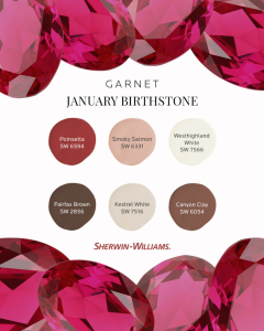
JANUARY BIRTHSTONE: GARNET
The garnet’s rich, red color symbolizes faith, love and courage — perfect traits for DIYers looking to refresh their home. Ready to create a nursery or guest room filled with rosy warmth? This January birthstone-inspired paint palette is the perfect place to start.
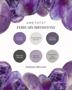
FEBRUARY BIRTHSTONE: AMETHYST
The deep purple of the amethyst represents royalty, passion and hope. Bring that regal spirit to your next painting project (the bedroom walls, perhaps?) with this February birthstone-inspired paint palette fit for a queen or king.
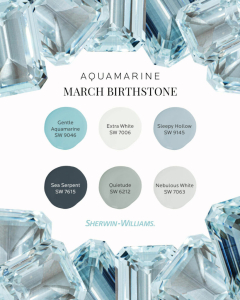
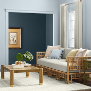
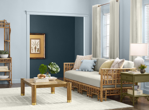
MARCH BIRTHSTONE: AQUAMARINE
Crisp and fresh, aquamarine symbolizes creativity, hope and self-expression. Tap into its light blue clarity for your next bathroom re-do with help from this March birthstone-inspired paint palette.
APRIL BIRTHSTONE: DIAMOND
Always sparkling with energy, the diamond symbolizes eternal love. The complementary colors in this April birthstone-inspired paint palette might just be ones you’ll adore forever — which makes them perfect for a kids’ room, don’t you think?

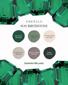
MAY BIRTHSTONE: EMERALD
Undeniably beautiful, the emerald’s gorgeous green color promotes health, faithfulness and wealth. If your next painting project is a home office, consider the hues from this May birthstone-inspired palette.
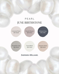
JUNE BIRTHSTONE: PEARL
It’s easy to see why the pearl is associated with modesty and purity. This paint palette features simple, subdued neutrals that perfectly embody those timeless characteristics. Try these June birthstone-inspired hues in hallways or other common areas.
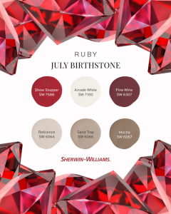
JULY BIRTHSTONE: RUBY
The ruby’s deep, dramatic red color symbolizes strength and courage — making it perfect for a front door. For beautifully balanced curb appeal, paint trim in one of the complementary warm neutrals from this July birthstone-inspired palette.
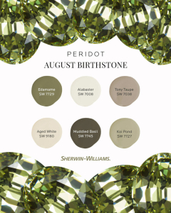
AUGUST BIRTHSTONE: PERIDOT
The lovely, light green of peridot promotes wealth and wisdom. Consider the colors from this August birthstone-inspired paint palette in family rooms or kitchens, the perfect gathering spots for meaningful conversations with loved ones.
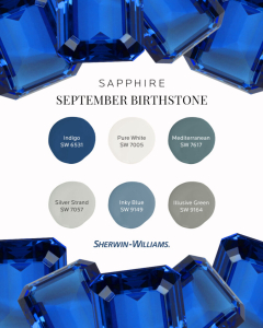
SEPTEMBER BIRTHSTONE: SAPPHIRE
The stunning blue sapphire represents truth and protection. So, never fear — use the hues from this September birthstone-inspired paint palette on a bathroom vanity or ceiling for character as powerful as the gemstone itself.
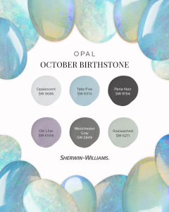
OCTOBER BIRTHSTONE: OPAL
The opulent opal represents hope and innocence. Mirroring the gemstone’s iridescence, this October birthstone-inspired paint palette features an array of happy hues guaranteed to add sparkle to a nursery or play space.
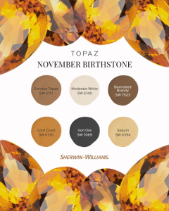
NOVEMBER BIRTHSTONE: TOPAZ
With its tranquil translucency, topaz symbolizes health and wellness in the mind and body. Have a home gym or workout area in need of a refresh? The colors from this November birthstone-inspired paint palette are an excellent “fit.”
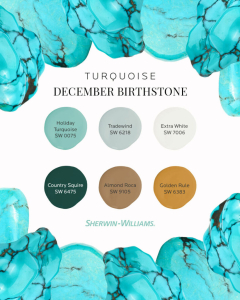
DECEMBER BIRTHSTONE: TURQUOISE
Happiness and good fortune are the hallmarks of turquoise. Perhaps the colors of this December birthstone-inspired paint palette are precisely what your entryway needs to ensure everyone comes and goes on the right foot?
From: 
A Blog by


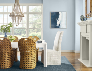
 Ease into the ethereal atmosphere of a soft blue that evokes the perfect peace of a morning walk on the beach. Upward’s easygoing attitude inspires simple yet total contentment.