An estimated 300 million people experience some form of color vision deficiency, otherwise known as color blindness. For those who are not color blind, it can feel nearly impossible to comprehend how those who fall on the color blind spectrum perceive color. Understanding the different forms of color vision deficiencies is the first step to confidently determine what colors will best work in a color blind home.
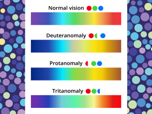
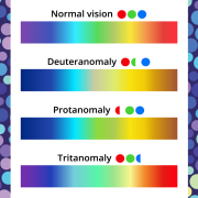
This color spectrum chart shows how three different types of color blindness impact color perception
NOT QUITE BLACK & WHITE
The biggest misconception about people who are color blind is that they see all colors in black and white. The truth is that over 99% of color blind people can see colors, they just interpret colors differently. True black and white color blindness, scientifically referred to as monochromacy or achromatopsia, is incredibly rare and impacts less than 1% of the color blind community. Let’s look at three specific forms of color blindness and their impact on color perception.

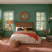
Left: How Billiard Green appears to someone with normal color vision
Right: How Billiard Green appears to someone with deuteranomaly
DEUTERANOMALY
Deuteranomaly is the most common form of color blindness and is often referred to as “red-green color blind.” Deuteranomaly accounts for 62.5% of all color blindness. Individuals who experience this form of color blindness have reduced sensitivity to green light, meaning that while shades of green can still be seen, they are interpreted differently. Those impacted by deuteranomaly typically have a tough time differentiating the following colors:
- Greens from reds
- Light greens from yellows
- Pinks from light grays

Left: How Fireweed appears to someone with normal color vision
Right: How Fireweed appears to someone with protanomaly
PROTANOMALY
Protanomaly is a rarer form of red-green color blindness, with those experiencing it making up 12.5% of the color blind community. Individuals with protanomaly have reduced sensitivity to red light. Those impacted by protanomaly typically have a tough time differentiating the following colors:
- Mid-reds from mid-greens
- Dark oranges and dark red
- Orange from mid-green
- Purples from blue

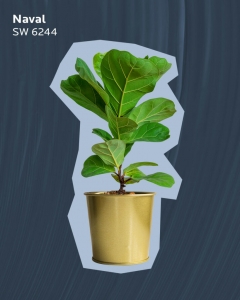
Left: How Naval appears to someone with normal color vision
Right: How Naval appears to someone with tritanomaly
TRITANOMALY
Tritanomaly is commonly referred to as “blue-yellow” color blind, but it is anything but common, making up only around 1% of the color blind community. Those with tritanomaly have reduced sensitivity to blue light and may struggle interpreting all shades of blue and nearby colors on the color spectrum, including yellow, green and purple. Those impacted by tritanomaly typically find it nearly impossible to perceive any colors aside from red.
COLOR BLIND COLOR COLLECTIONS
Now that we have identified the potential problem colors for these three types of color blindness, let’s take a look at some curated colors that can be enjoyed in a color blind home.
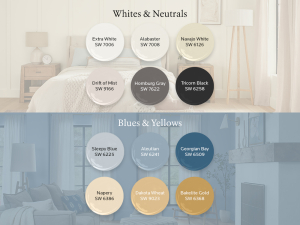
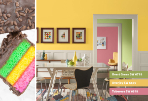
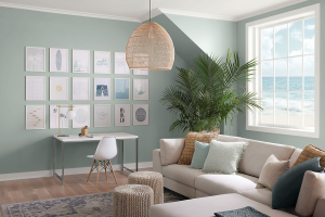
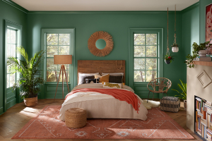
DEUTERANOMALY-FRIENDLY COLORS
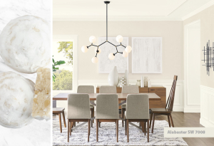
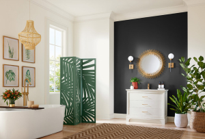
This color collection is a great for households that include someone who experiences deuteranomaly. Neutral colors like Extra White and Tricorn Black are great foundational colors that can be used either as the primary color or an accent, without any risk that they could be misinterpreted. For those who want to introduce some warm undertones, Alabaster and Navajo White can bring a cozy feel by leaning more yellow. Drift of Mist and Homburg Gray are cooler neutrals that stay away from any green undertones.
Yellow and blue tones are also great options for those with deuteranomaly, as long as you stay away from colors with green tints and undertones. Georgian Bay, Aleutian and Sleepy Blue provide a full scope of relaxing and calming blues. If you desire a warm and energetic space, Bakelite Gold, Dakota Wheat and Napery offer an abundance of cheerful charm.
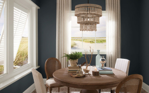
PROTANOMALY-FRIENDLY COLORS
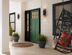
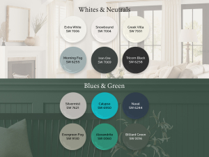
For the protanomaly color collection, these colors lean a tad cooler to stay away from warmer tones with reddish undertones. Cool whites and neutrals like Snowbound, Morning Fog and Iron Ore offer a variety of popular color options that work as a primary color or as an accent. If these colors feel too cool, Greek Villa has warm undertones and pairs beautifully with the other colors in the collection but is subtle enough that it won’t be confused with another color.
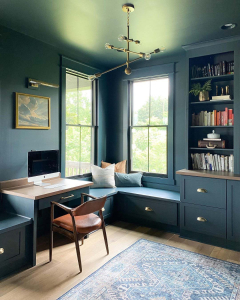
Naval, Calypso and Silvermist are excellent blue options that feature green undertones. The green undertones in these shades help stay far away from the red colors and shades that protanomaly struggle with. Green is also a great color, as long as you stay away from light and bright greens that may get confused with yellow. Dark greens and neutral greens such as Billiard Green and Evergreen Fog make for great options. Alexandrite is a vibrant shade of the green that pairs nicely with the blues featured in this collection and Greek Villa.
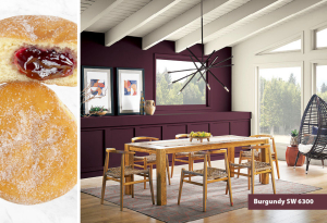
TRITANOMALY-FRIENDLY COLORS
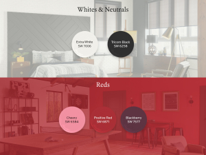
For those with Tritanomaly, most colors are impacted due to the reduced sensitivity to seeing blue. This can drastically impact how a person perceives the blue and yellow undertones featured in many white and neutrals paints. Because of the absence of any undertones, Extra White and Tricorn Black make great options.
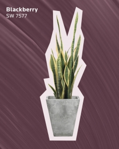
The color that is least impacted by tritanomaly is red. Consider one of Sherwin-Williams many vibrant reds, including Positive Red – the perfect color that falls right in the middle of the color spectrum. While red orange colors tend to lose their vibrancy, pink typically retains its color accuracy. This makes the dark, rich Blackberry and the vibrant Cheery good options.
BRING COLOR SAMPLES HOME
An important step in any color journey is to try colors in your home before you commit to a complete makeover. Colors can appear differently throughout the day due to ever-changing light conditions. For a color blind individual, this might not just cause a slight shift in tone, but a completely different interpretation of color. Make sure the entire household has honest conversations on what colors look like to them and what colors they like. Someone with deuteranomaly might love a shade of green even though they can’t fully interpret the color. Don’t forget, this is YOUR color journey, and the hue you choose is the one that’s perfect for you.
from TINTED – A Blog by Sherwin-Williams