What’s New in Restaurant Paint Color Palettes and Design?
Forget starched white tablecloths and muted palettes. Today, restaurants are designed to entertain, to surprise, to create Instagrammable moments — and color plays an essential role. Branding, mood, day-to-night ambiance and the personality of the chef or owner all give a restaurant its custom look. We spoke to nationally known commercial designers to discover the trends they’re creating.
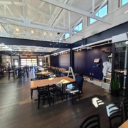
Natural Materials
Natural elements like wood and slate are very popular right now, according to Hannah Weiner, interior designer at Phase Zero Design in Boston.
“The trend is to create cozy, rustic, authentic spaces that lend an almost ‘mom and pop’ feel,” she says. “The effect is created by starting with 85 percent of neutral colors — mostly black contrasted with grays and whites. Once that neutral palette is laid, pops of color are added on accent walls, banquettes, upholstery, pillows and wall décor to give the space a warm feeling.”
Muted Pastels
Tanya Spaulding, principal at Shea Design in Minneapolis, sees restaurant design color going from an industrial, dark and heavy vibe to a lighter, more colorful one.
“Designers have been using gray as a primary base for restaurants for a while now, but I’m seeing that transform into muted pastels instead,” she says. “Incorporating these colors into smaller areas, like on a private dining room wall or on pillows, provides energy and life to a space, and can easily be updated every few years for a fresh look and feel.”
Plants
Another trend restaurant designers are seeing this year is the incorporation of indoor plants.
“Biophilic design — a way to connect people in a building to nature — is very popular right now,” says Alicia Kelly, senior interior designer at Studio K in Chicago. “There’s a new emphasis on sustainability and nature, so designers are using leafy greenery, succulents, air plants and trees as essential elements.”
Beyond Trends
Restaurant designers pay attention to what’s trending in dining décor, but most focus on creating a custom experience for the brand and the space.
“We actually like to avoid trends and go with what is unexpected,” Kelly says. “It’s more about creating a mood and telling the story of a particular chef or owner. Colors create feelings and energy, so we focus on the atmosphere first, choosing colors that can evoke the mood for daytime or nighttime dining.”
Weiner agrees, noting that not all restaurants can be designed in a cookie-cutter way. “Many of our clients have strong identities already,” she says. “So our job is often to use their brand colors in a unique way to create the atmosphere they want to achieve.”