
Introducing the Colormix® 2025 Forecast: Capsules
We are proud to use Sherwin Williams Paint and this month we’re featuring theColormix® 2025 Forecast: Capsules

For those looking for colors that tell the unique story of their home, our Colormix® 2025 Forecast: Capsules provides four inspiring palettes, expertly crafted from the year’s most trend-forward and immersive hues. “This forecast aims to tell the deeper stories behind the colors inside of a home through quiet luxury, joyful risk-taking, modern mindfulness, and building a better world for all, where everyone can find something to suit their space and style,” says Sue Wadden, Director of Color Marketing. These palettes make it easy to craft thoughtful, personal style in your home while keeping you well ahead of the color curve.

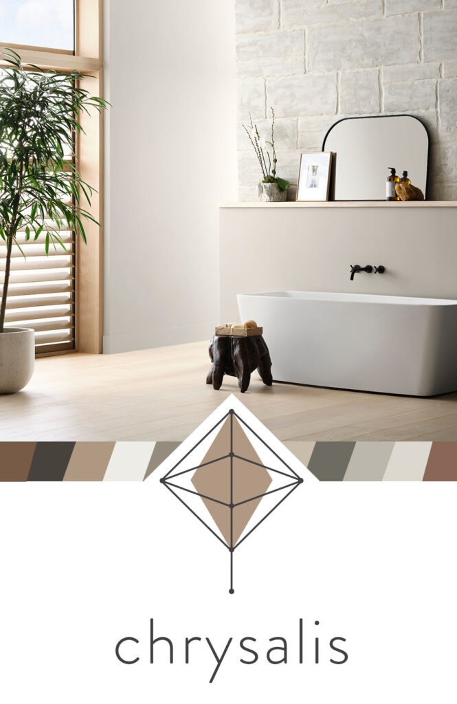
Creating a cozy haven of airy serenity is easy when you start with the right color palette. “Chrysalis offers minimalist, raw neutrals perfect for creating serene, uncluttered spaces that evoke a sense of calm and simplicity,” says Wadden. The soulful, nature-inspired hues of Chrysalis call to mind a slower pace, effortlessly crafting anchored, peaceful spaces of sanctuary. Deep, rooted earth tones like Grounded and Sealskin balance with subtle neutrals like Shiitake and Studio Clay to evoke a sense of stability, restfulness and comfort. Wind these tonal hues throughout the home to tie spaces together and infuse an overall easy vibe. The shades of Chrysalis bring endless versatility and combine in a myriad of ways to bring the laid-back influence of simple, minimalist style within reach.


Classic doesn’t have to be synonymous with staid. The colors of Wellspring reflect stability and tradition, but they also offer a fresh, reinvigorating perspective. “Drawing from heritage-inspired tones,” Wadden says, “Wellspring brings timeless elegance and a sense of history to modern interiors.” Curated to reflect enduring beauty, this palette is thoughtfully balanced to maintain an updated, current feel. Rich, sophisticated hues like Outerspace and French Roast bring depth and elegance to any space. Their dark undertones create a dramatic and calming atmosphere, making them versatile choices for any home or style. Pair them with the throwback golden tone of Bosc Pear to infuse freshness or keep it classic with a creamy neutral like Oyster White.

Kindred’s charming palette of diverse hues evokes the comforting but eclectic vibe of a patchwork quilt. These shades speak to the notion of carefully woven, intertwined belonging. “Kindred embraces warm, community-focused colors that foster connection and create inviting, cozy environments perfect for gathering,” according to Wadden. Unexpected and whimsical at heart, it also lends a cheerful, friendly tone. From the warmth of neutrals like Redend Point and Creamy to the rich, saturated tones of Red Tomato and Dark Night, Kindred’s thoughtfully balanced hues give space for everyone to find themselves in this palette, allowing for an infinite array of unique and authentic expressions with these hues.
From:

A Blog by![]()

