


It’s the middle of summer and the sun and heat can play havoc on your homes paint. House paint fading due to ultraviolet (UV) rays from the sun, moisture, pollution, and poor-quality paints, with darker, brighter, and organically pigmented paints fading fastest. To prevent fading, choose high-quality, exterior-grade paint with a lighter, more inorganic pigment, use a higher sheen, and apply multiple coats. Regular washing and selecting an appropriate color for your climate can also extend the life of your paint.
Colors will fade slightly when exposed to intense sunlight. As the coating ages, the fading can become more noticeable. Slight fading is acceptable,
provided it is gradual and uniform so as not to be noticeable. Excessive chalking of the paint film will cause colors to appear lighter.
Interior-grade colorants used outside will fade.
Adding more tint to the coating than is recommended.

Interior coatings may also fade if they are near windows and there is significant sunlight exposure.
We use superior quality Sherwin Williams paints like:
Emerald®
Duration®
Resilience™
SuperPaint®
A-100®
WoodScapes®
These paints are designed to sustain intense heat and UV rays. Most especially SuperPaint® Exterior Acrylic Latex delivers outstanding performance and protect against the elements. Cold and frosty or hot and humid, this formula goes on smooth and resists fading and peeling. And thanks to its advanced acrylic resin technology, you’ll enjoy outstanding adhesion and color retention. SuperPaint offers a dirt-resistant and mildew-resistant coating.
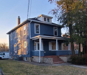
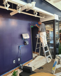
 As many homes in our area still have trees on some sides, uneven color fading can occur. This is our forte to pay attention to correct preparation and application of our products. Having been in the Catonsville area for so many years. We know how important independence day celebrations are. Sometimes power washing can extend the life of your paint and temporarily brighten your home. And when the festivities have passed, serious work can be done to restore your homes beauty. Summer allows for long days of proper work.
We use high-quality drop cloths and tarps to protect the soil and plants beneath. We ensure that these materials are large enough to cover the entire area where paint might fall. Drop cloths are spread out and securely fastened to prevent them from moving around and exposing parts of your landscaping. We also us plastic sheeting to provide an additional layer of protection for delicate plants or areas where you expect heavy paint activity. Plastic sheeting is particularly useful for covering large areas or for plants that are particularly sensitive to paint exposure.


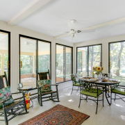
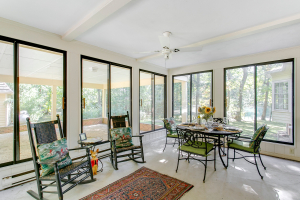 The sunroom is often the favorite room in the house. A fresh coat of paint will brighten it up and enhance your enjoyment.
We take great care to protect your windows and flooring while cutting in and painting your ceiling.
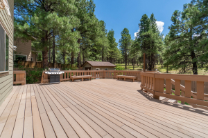
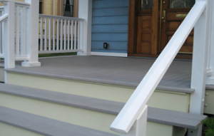
May is a great time to resurface your deck.
Preparation is key to ensuring longevity and durability of your deck.
We clean the deck using a deck cleaner and a stiff brush, and then rinse thoroughly. After the deck dries, we sand any rough spots to ensure a smooth surface. If any repairs or wood needs to be replaced, that is also a part of our process. We use Sherwin Williams products and this is their recommendation on the difference in stain transparencies.
Clear, transparent and semi-transparent stains work best on new wood, and nicely show off that fresh grain.
Semi-solid stains are a great choice for decks that get a lot of use. This option shows some grain while hiding more wear and tear.
Solid stains are best fit for decks with older, more vulnerable wood, surfaces with many blemishes or when you want to go bold with color.
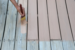
We use a brush for detail work and to work the stain into the wood, but then use a sprayer for large, flat surfaces, followed by back-brushing to ensure proper penetration and an even coat.
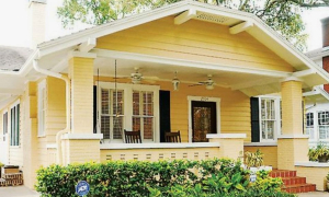
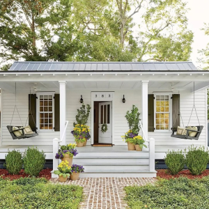
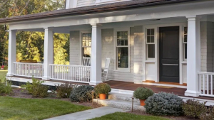
When it comes to the front porch, there are more elements to consider. The deck of the porch, the railings, support posts, ceiling, and steps are elements that require inspection and consideration.
Often there can be rotted flooring that needs to be replaced before the painting can begin. Color choices need to be made for the different parts of the front porch. Matching the step risers with the front of the house wall or considering a complimetnary color. The flooring can be stained or painted. And ceiling colors also need to be considered.


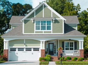
Here’s why spring is a great time for exterior painting:
Spring weather is typically moderate, with temperatures that are not too hot or too cold, making it ideal for paint application and proper curing.
Spring is a good time to address winter damage like mildew growth and moisture issues, which can lead to paint cracking, blistering, and peeling.
Painting your home’s exterior in the spring allows you to get it looking its best before the summer season, when you’ll likely be spending more time outdoors
Exterior paints perform well when the weather is mild, with temperatures between 50 and 85 degrees Fahrenheit being recommended.
Completing the painting project in the spring frees up your summer schedule for other activities and outdoor projects.
While painting, you can easily notice other damaged areas that need repair, such as wood rot or exposed surfaces.
In hot summer conditions, paint may dry too quickly, preventing proper film formation. Spring temperatures allow for a more gradual drying process.
Spring temperatures are less likely to dip too low, which can cause issues with paint application and curing.
Prepare for Other Outdoor Projects:
Painting your home’s exterior before starting other outdoor projects can make the painting process easier and prevent paint from getting on new plants or landscape features.


For those looking for colors that tell the unique story of their home, our Colormix® 2025 Forecast: Capsules provides four inspiring palettes, expertly crafted from the year’s most trend-forward and immersive hues. “This forecast aims to tell the deeper stories behind the colors inside of a home through quiet luxury, joyful risk-taking, modern mindfulness, and building a better world for all, where everyone can find something to suit their space and style,” says Sue Wadden, Director of Color Marketing. These palettes make it easy to craft thoughtful, personal style in your home while keeping you well ahead of the color curve.

Creating a cozy haven of airy serenity is easy when you start with the right color palette. “Chrysalis offers minimalist, raw neutrals perfect for creating serene, uncluttered spaces that evoke a sense of calm and simplicity,” says Wadden. The soulful, nature-inspired hues of Chrysalis call to mind a slower pace, effortlessly crafting anchored, peaceful spaces of sanctuary. Deep, rooted earth tones like Grounded and Sealskin balance with subtle neutrals like Shiitake and Studio Clay to evoke a sense of stability, restfulness and comfort. Wind these tonal hues throughout the home to tie spaces together and infuse an overall easy vibe. The shades of Chrysalis bring endless versatility and combine in a myriad of ways to bring the laid-back influence of simple, minimalist style within reach.


Classic doesn’t have to be synonymous with staid. The colors of Wellspring reflect stability and tradition, but they also offer a fresh, reinvigorating perspective. “Drawing from heritage-inspired tones,” Wadden says, “Wellspring brings timeless elegance and a sense of history to modern interiors.” Curated to reflect enduring beauty, this palette is thoughtfully balanced to maintain an updated, current feel. Rich, sophisticated hues like Outerspace and French Roast bring depth and elegance to any space. Their dark undertones create a dramatic and calming atmosphere, making them versatile choices for any home or style. Pair them with the throwback golden tone of Bosc Pear to infuse freshness or keep it classic with a creamy neutral like Oyster White.

Kindred’s charming palette of diverse hues evokes the comforting but eclectic vibe of a patchwork quilt. These shades speak to the notion of carefully woven, intertwined belonging. “Kindred embraces warm, community-focused colors that foster connection and create inviting, cozy environments perfect for gathering,” according to Wadden. Unexpected and whimsical at heart, it also lends a cheerful, friendly tone. From the warmth of neutrals like Redend Point and Creamy to the rich, saturated tones of Red Tomato and Dark Night, Kindred’s thoughtfully balanced hues give space for everyone to find themselves in this palette, allowing for an infinite array of unique and authentic expressions with these hues.
From:

A Blog by![]()

Bella Pink is a favorite color for girls rooms.

Exuberant Pink is a little more mature and a favorite of girly girls.

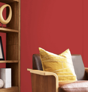
Heartfelt is a warm red that shows well in many different rooms.

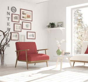
Valentine is just the right combination of pink and red to satisfy all ages.

Real Red is perfect for living spaces and is conducive to thinking and energy. Turn up the dramatic energy with this bright red hue – perfect for inspiring lively conversation around the dinner table.

Showstopper – This deep red with its orange undertone will grab everyone’s attention thanks to its rich, dramatic tone. Pair with off-white for a bold, expressive mood.


When the temperatures are low, you will most likely find yourself spending more time indoors. This is the perfect time to dream up home improvement projects. Since the sky is gray and dismal, and it’s too cold too get the outside of your home painted. Why not bring warm and light into your home with interior painting?
The temperature range for paint is 50 degrees F / 10 degrees C to 95 degrees F / 35 degrees C, with the middle of those being ideal for paint setting. That’s why weather plays such a factor for giving the exterior of your home a facelift. When the temperature drops below 55 degrees F 12.778 degrees Celsius (C), it slows down the process of the paint curing. If this happens, paint takes longer to dry, and insects, dirt, grime and other debris may get stuck on your surface. In addition, a surface that has improperly cured has a higher risk of cracking, peeling and chipping, and a reduction of the overall life expectancy of the paint.


From our friends at Sherwin Williams here is a look at the 2025 – Color Capsule of the Year.

SW 6089
Made to envelop spaces in the comfort of its eternally calming nature, this versatile brown from our 2025 Colormix® Forecast imparts richness and the stability of a refined earthen tone.

SW 9585

Color of The Month — Mount Etna

A cascade of rich fall hues comes together in October’s Autumn Fog palette to create cozy spaces of sophisticated style. Mount Etna’s lush blue-green shade anchors this collection of deep, earthy shades.


Saddle up and settle into the enduring allure of the old west in a cozy style that blends vintage Americana with dark, immersive color. Mount Etna provides the ultimate dramatic backdrop of moody mystery for contrasting elements to mix and mingle. From the rich, worn leather hinting at Burnished Brandy to an old, patterned rug picking up the deep crimson shade of Rookwood Red, the layered textures and colors of this space create a warm atmosphere of sophisticated but comfy rustic charm perfect for kicking back and kicking off your boots.
Get the look: Worn Leather, Dark Color Palette, Vintage Western Decor

The Autumn Fog palette naturally creates the deep contrast that distinguishes this style. Mount Etna evokes the moody, dramatic character of the look while Downing Stone brings a light influence and highlights its western, ranch-inspired side. Round up an eclectic mix of antique chairs to couple with a worn, chunky farmhouse table to infuse a laid-back, rugged feel to the space. Industrial-inspired statement lighting and framed prints of ranch life and western landscapes complete the down-home vibe.
Get the look: Framed Western Landscapes, Statement Lighting, Worn Wood
COURTESY OF:
![]()
A Blog by![]()


