Designer Color Collection featuring Pure and Pristine whites, styled in a bright modern interior by Hands On Painters.

Designer Color Collection featuring Pure + Pristine

Looking for the perfect white paint color? Finding the right one can be tricky. With the endless array of undertones available, it can feel a little like the Goldilocks conundrum: too warm or too cold. Don’t worry though – we’ve got you covered! The new Pure + Pristine palette from our Designer Color Collection makes it easier than ever to find your just-right white.

Pure + Pristine

The Pure + Pristine palette showcases forty of the brightest, cleanest, and most beautiful whites Sherwin-Williams has ever offered, elegantly arranged in two distinct sub-palettes: warm whites and cool whites. The stunning brightness of these hues is owed to our unique base, UltraWhite SW 9500, a shade that rivals the most brilliant whites on the market. Each one timeless and transcendent, these designer-loved whites offer outstanding versatility.

Featured Color: Snowbelt SW 9623  

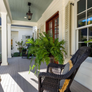
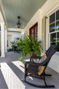
Light + Luminous (Cool Whites)

Looking for a crisp, cool white? You’re certain to find it in the Light + Luminous palette. Create refined and serene spaces by complementing these cool whites with cool greys and charcoals. Begin with a crisp, clean white like White Snow or Natural White to establish a bright and airy foundation. Integrate a range of cool greys, from the softer hued Grey Heron to a deeper shade like Before the Storm, to add depth and sophistication. Dark charcoal accents provide striking contrast, enhancing the overall modern aesthetic. The interplay of these tones, combined with varying textures such as smooth surfaces and plus fabrics, creates a visually dynamic and harmonious environment.


Featured Color: Cheviot SW 9503


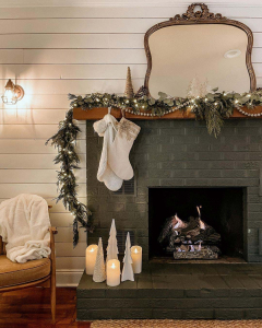
Warmth + Wonder (Warm Whites)

Cozy up to the Warmth + Wonder palette and create pulled-together personal spaces that feel comfortable and inviting. Start with soft, creamy whites like Alabaster or Greek Villa to establish a snug backdrop. Integrate a range of warmer neutrals, from the light beige of Warm Winter to a rich taupe like Hibernate, to add depth and a sense of comfort. Accents in natural tones such as earthy brown and muted tans provide a harmonious contrast, enhancing the overall welcoming aesthetic.

COURTESY OF:

A Blog by

Smoky Azurite paint color featured in a modern living space by Hands On Painters Inc.

August 2024

Color of The Month – Smoky Azurite

August’s Modern Brit palette plays host to traditional, British style with a twist. Deep, anchoring earth tones blend with muted, mid-tone neutrals to bring a fun and fresh feel to classic elegance. Our Color of the Month, Smoky Azurite, lifts this collection of subtle but stunning tones to an elevated version of an age-old aesthetic.

Kitchen Comfort

Craft an inviting atmosphere of laid-back sophistication in the heart of the home with a buttoned-up blue that knows how to unwind. Smoky Azurite’s captivating shade stands out against Black Fox’s rich, grounded hue to make a refined statement. Arrowroote provides the perfect neutral backdrop, creating a bright, clean canvas for the bolder shades to shine.

Get the look: Walnut Tones, Antique Brass Finishes, Earth Tones

Poised Elegance

Brimming with thoughtful details, this look seamlessly blends easy comfort with a sophisticated flair to create a cozy countryside atmosphere. A backdrop of Smoky Azurite’s relaxed vibrance infuses the room with freshness, lending a subtle contemporary vibe to the otherwise quiet and simple space. Adding rich contrast and a rustic note, dark brown wood tones make a beautiful pairing with the natural shades of this palette.

Get the look: Framed Artwork, Patterned Rugs, Ceramics

Cordial Greetings

The humble hues of the Modern Brit palette instantly impart the warm and familiar charm of home to any space. Smoky Azurite’s welcoming shade casts its soft, soothing energy even in a supporting role, as Earthy Ochre balances the carefree, airiness of the space with its down to earth, rooted hue. A collection of shades as uncomplicated and approachable as these brings timeless, comfortable style easily within reach.

Get the look: Natural Wood Tones, Stone Flooring, Mixed Textures

COURTESY OF:

A Blog by


Sherwin-Williams Wallflower paint color featured in a bright summer-inspired room by Hands On Painters Inc.

JULY 2024

COLOR OF THE MONTH

HERON PLUME


Summer is the perfect time to highlight an easy, breezy style that revolves around simple but stunning color. Grounded in a modern palette of natural neutrals and warm earth tones, July’s California Love color collection effortlessly creates a beautiful oasis of casual comfort.

COLLECTED COASTAL

This inviting shade of warm white seamlessly blends modern simplicity with traditional style. Heron Plume’s laid-back energy is perfect for the refined yet relaxed sophistication of California coastal style. When paired with the nature-inspired coordinating hues of the California Love palette, this airy shade makes crafting casual style a breeze.

Get the look: Round Silhouettes, Large Floor Plants, Timber Ceiling, White Backdrop

SERENE SIMPLICITY

Settle into serenity with the subtle, relaxing influence of simple color. A layered approach to the soft, tonal neutrals of this month’s palette builds to evoke a cozy sense of tranquility in a bedroom retreat. Heron Plume’s warming shade of creamy white paired with Pachyderm’s soft greige tone creates a clean backdrop for other elements of coastal style to stand out. Textured natural materials like jute and wicker mix with layered wood tones to add depth and contrast while highlighting the organic, outdoor feel of the space.

Get the look: Honey Wood Tones, Rattan, Layered Textures, Floor Plants

AN INVITING IMPRESSION

Whether inside or out, Heron Plume’s warmth radiates an easygoing, welcoming vibe to greet guests. A rich blue-green shade like Mount Etna makes a striking first impression, adding bold contrast that elevates the exterior and sets the tone.

Get the look: Mixed Textures, Earth Tones, Greenery, Layered Elements

COURTESY OF:

tinted logo

A Blog by SHERWIN WILLIAMS

Colorful maximalist living room with layered decor and bold painted walls by Hands On Painters Inc.

5 Maximalist-Inspired Spaces We Love

The best part about maximalism? Anything goes – it’s as simple as that. We’re sharing some of our favorite spaces from maximalists like you that prove dialed-up style should always be brighter, bolder, and busier.

Photo Courtesy of @thegoodwrench
Featured Color: Moody Blue SW 6221

MIX IT ALL

Throw the rule book out the window! Embracing an over-the-top look that mixes textures, genres and prints doesn’t have to be tricky. A statement hue like Moody Blue grounds the space by washing walls in a solid color that leaves you with more room to play with pattern. 

Photo Courtesy of @ashleyswhiteside
Featured Color: Mount Etna SW 7625

KEEP IT COLORFUL

Feeling inspired by a bold painting or patterned chair? Statement pieces are the perfect starting point to build your maximalist escape. Taking color cues from artwork or accessories lets you create a cohesive palette that always ties back to your focal point. We love the way Mount Etna was used on the walls to make the pink and teal accents in this room stand out.

Photo Courtesy of @speakingofdiy
Featured Color: Granite Peak SW 6250

TELL YOUR STORY

Give decor with a story a place to shine. A colorful gallery wall is the perfect space where old meets new, so you can easily work in modern and vintage additions alike. Granite Peak offers a neutral backdrop for other unexpected elements like printed floral curtains and geometric rugs to be woven in.

hoto Courtesy of @home_ec_op
Featured Colors: Espalier SW 6734 (Ceiling) Extra White SW 7006 (Walls)

BRIGHTER IS BETTER

Set the stage for a burst of color and texture with white walls. Hues of equal intensity create balance in a space that puts color first. For a floor-to-ceiling maximalist look, think beyond the wall! Make the most of your ceiling space by contrasting Extra White walls with a burst of energy from a hue like Espalier.

Photo Courtesy of @themrdarcy
Featured Color: Tricorn Black SW 6258

THE MODERN MAXIMALIST

Black may be the absence of color, but it sets the perfect foundation for a maxed-out modern space. Offset the drama of Tricorn Black with bright, luxurious furnishings for a look that is balanced and bold. Keep accessories and other furnishings light and bright to keep the energy in the space lifted.

Courtesy of:

A Blog by

Sherwin Williams Logog
Modern home exterior featuring bold paint colors and professional finish by Hands On Painters Inc.

HOUSE EXTERIOR INSPIRATION

When it comes to transforming the look of your home’s exterior, the right paint colors can make all the difference. Whether you’re aiming for a timeless and elegant appeal or a vibrant and eye-catching statement, we can help you find the right colors and inspiration to suit your style.

From classic neutrals that exemplify sophistication to bold and adventurous shades that showcase your personality, our curated collection of exterior paint ideas will help you spark your creativity and enhance your home’s curb appeal.

A home’s exterior is the first thing everyone sees – make a colorful first impression! From classic blues to cheerful yellows, we love the view that these trending hues create.

ENDLESS SEA

Endless Sea’s vivid shade of blue draws you in with a jewel-toned charm that speaks for itself. Whether it’s used on a colonial or a craftsman, this welcoming hue brings a classic beauty to any home’s exterior.

GOSSAMER VEIL

Add a hint of color with Gossamer Veil. This light shade of gray features subtle green undertones that lend this hue its versatile look. Whether you pair it with warm tones or cool tones, this transitional shade goes with either.

CYBERSPACE

Cyberspace’s bold shade of charcoal is a go-to favorite that’s known for making a statement. Not only does this rich hue create attention-grabbing color, but its neutral tone helps design an exterior that plays well with everything.

CREAMY

Farmhouse charm surrounds this shade of white that’s all about simple style. Creamy’s warm hue is soft and inviting to create a neutral backdrop where other exterior details like shutters and doors can stand out.

GAMBOL GOLD

Say hello to a cheerful home with Gambol Gold. This happy hue is the perfect color for a bright exterior that feels warm and inviting all year long. Pair this golden shade with white trim to create a color combination that’s timeless.

From

tinted logo

A Blog by Sherwin Williams

Freshly painted home exterior showing enhanced curb appeal with modern color scheme by Hands On Painters Inc.

Crank Up Your Curb Appeal

Crank Up Your Curb Appeal

Looking to crank up your home’s curb appeal? Create an attention-grabbing style with our tips and tricks for simple ways to enhance your home’s exterior.


HOW CAN I ENHANCE MY HOMES CURB APPEAL?


Those architectural details make your home unique – play them up! Does your home have incredible trim? Pick a color to enhance that. Maybe there are two forms of siding on your home — consider using two separate body colors to add some contrast. The unique aspects of your home can be a fun way to make a bold impression.


WHAT KIND OF DESIGN RESOURCES ARE OUT THERE?

Design resources are EVERYWHERE! Magazines, nearby homes and websites like Pinterest will help you identify what color schemes you gravitate toward. Once you have some selections in mind, let Sherwin-Williams and the ColorSnap® Visualizer help you finish the job. Upload a photo of your own home or select one of our pre-selected exterior shots to play with color and share your schemes with family and friends to get their opinions too!


 HOW DO I CREATE THE PERFECT PALETTE?

Think in terms of color pairs. For example, coordinating a dark siding color with white trim creates strong contrast, leaving room for accent colors to be used in other areas like shutters or doors. If you have a neutral siding and trim palette, a boldly-colored front door will make a statement. And remember, to create color harmony for your home, keep your exterior palette between four to five colors.


WHAT ELSE DO I NEED?

Samples! It’s important to get some color samples once you have narrowed down your choices. Get some color chips online or from your neighborhood Sherwin-Williams store and tape them up on your house for a day or two. Look at the colors throughout the day and in different weather if possible, because color can change depending on the conditions. Sherwin-Williams paint experts will also tint a small Color to Go® sample that you can take home and use to test on an area of your house. The recommended size would be about 24” x 36”. Take your time, because this final phase of the color selection process is really critical to success.


From tinted logo

A Blog by

Old wooden deck being cleaned and sanded before painting by Hands On Painters Inc.

How to Prepare an Old Deck for Painting

Is your deck looking a little worse for wear? Do you wish it was in better shape for entertaining or enjoying with your family? Weather and time can take a heavy toll on your deck, leaving the paint peeling and chipped and overall looking less than stellar. But painting an old deck requires proper preparation.

Removing Old Deck Paint

You can’t just apply a fresh coat of paint on your deck and expect to get great results. Dust, dirt, and chipped paint all create a bumpy surface for application. Before even cracking open that can of paint, here are some steps you can take to ensure your old deck comes out looking good as new:

  1. Wash the deck using deck cleaner and a stiff broom. Cleaning will remove dirt, debris, mold and mildew, and some loose paint. A neutralizer may be required depending on the type of cleaner being used.
  1. Scrape the deck material using a soft bristle brush and paint scraper to remove old paint so the new paint will stick evenly without chipping or bubbling.
  1. Lightly sand any additional loose paint or rough areas to make a smooth surface, which is easier to paint and will seal more effectively to protect the wood.

Now that your deck is prepped and ready for painting, it’s time to pick the best product. An old deck requires a little more TLC than a new one due to natural wear from sun, water, snow, and use. To help give it extra longevity so you can get many more years of use out of it, here’s what to look for in deck paint:

  1. Opacity. This is important because it controls how much wood grain is visible through the paint. The higher the opacity, the less wood grain you’ll see. An older deck with lots of wear and tear might benefit from higher opacity to hide the flaws.
  1. Durability. A paint’s durability is particularly important when choosing it for use on an old deck because weather, foot traffic from pets and people, and daily use can break down paint quickly. A durable paint will protect the deck and help the paint last.
  1. Texture. You don’t want to use smooth paint for the flat surface because it will be too slippery, but you don’t need highly textured paint for the vertical sections. Knowing what texture to use and where to use it will increase the success of your paint job. Non-slip additives are the way to go on vertical areas.


Birthstone-inspired paint palette featuring gemstone hues and elegant interior color combinations by Hands On Painters Inc.

Birthstone-Inspired Paint Palettes

Birthstone-Inspired Paint Palettes

Most of us know our birthstone. But how familiar are you with the unique and wonderful characteristics your gemstone is thought to possess? Join our colorful journey to discover curated Sherwin-Williams paint palettes inspired by each month’s birthstone and its meanings. Plus, find the inspiration, guidance, tools—and even free color chips—to get your DIY project started.


JANUARY BIRTHSTONE: GARNET

The garnet’s rich, red color symbolizes faith, love and courage — perfect traits for DIYers looking to refresh their home. Ready to create a nursery or guest room filled with rosy warmth? This January birthstone-inspired paint palette is the perfect place to start.


FEBRUARY BIRTHSTONE: AMETHYST

The deep purple of the amethyst represents royalty, passion and hope. Bring that regal spirit to your next painting project (the bedroom walls, perhaps?) with this February birthstone-inspired paint palette fit for a queen or king.


MARCH BIRTHSTONE: AQUAMARINE

Crisp and fresh, aquamarine symbolizes creativity, hope and self-expression. Tap into its light blue clarity for your next bathroom re-do with help from this March birthstone-inspired paint palette.


APRIL BIRTHSTONE: DIAMOND

Always sparkling with energy, the diamond symbolizes eternal love. The complementary colors in this April birthstone-inspired paint palette might just be ones you’ll adore forever — which makes them perfect for a kids’ room, don’t you think?


MAY BIRTHSTONE: EMERALD

Undeniably beautiful, the emerald’s gorgeous green color promotes health, faithfulness and wealth. If your next painting project is a home office, consider the hues from this May birthstone-inspired palette.


JUNE BIRTHSTONE: PEARL

It’s easy to see why the pearl is associated with modesty and purity. This paint palette features simple, subdued neutrals that perfectly embody those timeless characteristics. Try these June birthstone-inspired hues in hallways or other common areas.


JULY BIRTHSTONE: RUBY

The ruby’s deep, dramatic red color symbolizes strength and courage — making it perfect for a front door. For beautifully balanced curb appeal, paint trim in one of the complementary warm neutrals from this July birthstone-inspired palette.


AUGUST BIRTHSTONE: PERIDOT

The lovely, light green of peridot promotes wealth and wisdom. Consider the colors from this August birthstone-inspired paint palette in family rooms or kitchens, the perfect gathering spots for meaningful conversations with loved ones.


SEPTEMBER BIRTHSTONE: SAPPHIRE

The stunning blue sapphire represents truth and protection. So, never fear — use the hues from this September birthstone-inspired paint palette on a bathroom vanity or ceiling for character as powerful as the gemstone itself.


OCTOBER BIRTHSTONE: OPAL

The opulent opal represents hope and innocence. Mirroring the gemstone’s iridescence, this October birthstone-inspired paint palette features an array of happy hues guaranteed to add sparkle to a nursery or play space.


NOVEMBER BIRTHSTONE: TOPAZ

With its tranquil translucency, topaz symbolizes health and wellness in the mind and body. Have a home gym or workout area in need of a refresh? The colors from this November birthstone-inspired paint palette are an excellent “fit.”


DECEMBER BIRTHSTONE: TURQUOISE

Happiness and good fortune are the hallmarks of turquoise. Perhaps the colors of this December birthstone-inspired paint palette are precisely what your entryway needs to ensure everyone comes and goes on the right foot?


From: tinted logo

A Blog by

Soft blue wall color ‘Upward’ by Sherwin Williams, creating a tranquil coastal-inspired interior painted by Hands On Painters Inc.

COLOR OF THE MONTH – UPWARD

January 2024

COLOR OF THE MONTH

UPWARD

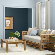
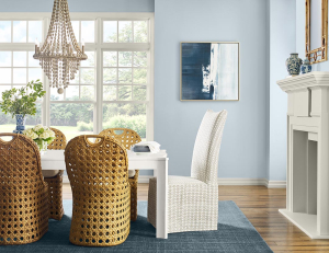
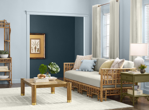
Ease into the ethereal atmosphere of a soft blue that evokes the perfect peace of a morning walk on the beach. Upward’s easygoing attitude inspires simple yet total contentment.


Relaxed                                                     Classic                                               Breezy


SIMPLE SERENITY

Embrace the simple comfort of a shade that captures the limitless wonder of a bright summer sky. Upward’s breezy, pale hue gently washes living spaces with its buoyant, uplifting energy, effortlessly crafting an airy yet inviting atmosphere. Its serene character, reminiscent of the tranquil beauty of the seaside, is perfect for a coastal-inspired interior. The deep marine-blue of Gale Force – the anchor of this month’s palette – grounds the mostly neutral space, providing balance and a note of cozy moodiness.


KEEPING IT CASUAL

The classic and timeless appeal of this color is right at home in a relaxed modern coastal dining space. As a calming backdrop, Upward offers versatility and a clean touch to a look that relies on a simple palette of light neutrals. Paired with natural elements, woven textures and natural wood tones, this humble hue inspires a sense of casual, understated sophistication to balance the minimalist side of this aesthetic.

From:

A Blog by


Ready for the Holidays, Hands On Painters house painting contractor in Baltimore arriving with branded van for a residential project

3 Easy Ways to Get Your Home Ready for the Holidays

The holidays are knocking at the door with guests not far behind. It’s a joyful but busy season of hosting and gathering. We’ve pulled together three simple DIYs to help you freshen up your home yet leave you ready to relax and enjoy all the moments that matter most.

Photo Courtesy of @jg_propertysolutions
Featured Color: Iron Ore SW 7069 

Work Some Magic in the Dining Room

During the holidays, the dining room can become a cramped and crowded hub for hosting. For a more spacious feel, create the illusion of depth with color. A dark hue like Iron Ore can achieve this while also bringing an elevated look to the space. Paint just an accent wall or cover walls and trim with the same color to soften angles and evoke the impression of expansiveness.


Photo Courtesy of @our_edith_house
 Featured Color: Mount Etna SW 7625

A Little Love for the Trim

Refreshing trim is a simple and often-overlooked way to make an impact with little input of time or cost. To heighten the drama, go for a monochrome look using a moody shade like Mount Etna. Blending the trim, walls, and ceiling brings harmony and creates the impression of open space. Or, to keep things more simple, you could choose a darker contrasting color and paint just the trim to define borders with sharp, bold lines. Make the project even easier and simply touch up the existing color for a fresh, clean look.


Photo Courtesy of @tracyzlock
Featured Color: Pewter Green SW 6208


Freshen Up the Fireplace

Gather round and nestle in to the cozy vibes with a quick and easy fireplace refresh. This festive focal point provides the perfect backdrop for your holiday gatherings. With a bold neutral like Pewter Green, this DIY can make a big impression year-round. It’s an easy, statement-making update that will grab the notice of family and friends.


from TINTED – A Blog by Sherwin-Williams